PB Responsive Images WordPress Plugin
Adds support for the proposed responsive image format in post content, and helper functions for theme authors.
The PB Responsive Images plugin automatically reformats all images in the post content into a format similar to the picture tag proposed by the Responsive Images Community Group on w3.org.
The default configuration provides the necessary image sizes for the Twenty Eleven theme for reference; you'll have to customize the configuration to fit your theme best. Eace image is reformatted based on standard CSS media queries and SLIR image query pairs, giving a huge amount of flexibility in the variety of query combinations. For example, with a media query of (min-width:500) and a resize query of w700, a version of the image at most 700 pixels wide will display only when the screen is greater than 500 pixels wide. Additionally, the plugin provides shortcodes that allow you to customize the que
images
polyfill
responsive images




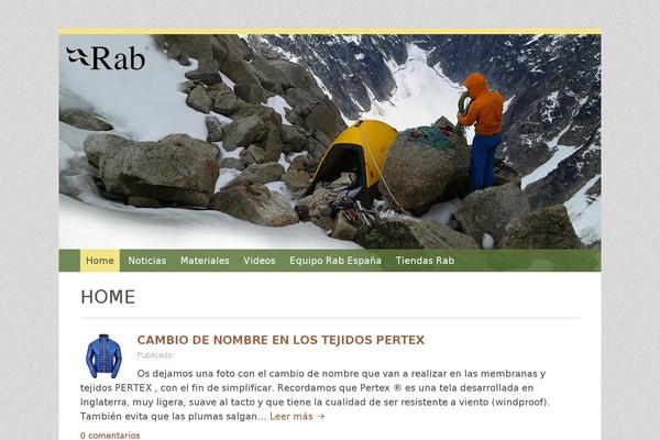
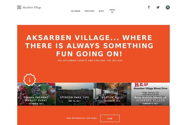
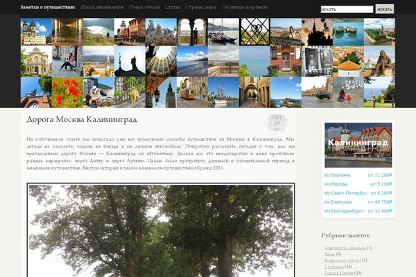
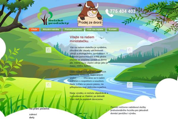
Sites running PB Responsive Images, click to open one
Plugins with a similar footprint
Ranked by how many sites run them — a quick way to compare alternatives.

Usage of PB Responsive Images over time
June 2023 — July 2024Between June 2023 and July 2024 the number of sites running this plugin went from 22 to 18 — down 4 (-18.2%).
| Month | Sites | Change |
|---|---|---|
| July 2024 | 18 | -2 |
| June 2024 | 20 | +1 |
| May 2024 | 19 | +0 |
| April 2024 | 19 | -1 |
| March 2024 | 20 | +1 |
| February 2024 | 19 | +0 |
| January 2024 | 19 | +2 |
| December 2023 | 17 | -1 |
| November 2023 | 18 | +0 |
| October 2023 | 18 | -1 |
| September 2023 | 19 | -1 |
| August 2023 | 20 | -3 |
| July 2023 | 23 | +1 |
| June 2023 | 22 | — |
Sites running PB Responsive Images
All sites in the collection18 examples from the collection. Open any site to see the theme and plugins we found on it.